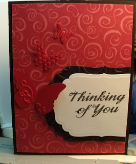
So the thing about this card is that I used a sketch from PaperCrafts magazine to start. I made the card like this.....
It is a nice simple card. Actually, I did 2 of them like this. I used an old stamp for the words. the shapes were cut out with a nestabilities die and then the black piece was textured with a cuttlebug die. Very nice but just needed a little something. So I added this...
Isn't it amazing what that little bit does for the card! I love it now. Simple but wonderful! Here is a version with red butterflies but I think I like the black the best.
And then here is one of the two I did with a horizontal layout. I did a total of 4 cards. I am trying not to have as much left over paper so I used the whole sheet of background paper. That paper came from Tuesday Morning. I don't remember the company.


Red and black makes such a lovely combination. Nice card Faye! Cheers, Lora Sinkler-Lake www.crazystamper.typepad.com
ReplyDelete